I came across an article Learn CSS Flexbox by Building 5 Responsive Layouts in which the author neatly explains the concept. As I'm extensively using Angular, Angular Material and Angular FlexLayout, I though of reproducing the layouts with FlexLayout.
Layout 1 - Responsive Card Layout
This is a responsive card layout adjusting the number of cards based on the available width.

<div fxLayout="row wrap" class="container">
  <div fxFlex *ngFor="let i of [1, 2, 3, 4, 5, 6, 7, 8, 9]">
    <div class="grid-item" fxLayout="row" fxLayoutAlign="center center">
      {{ 'Item ' + i }}
    </div>
  </div>
</div>
.container {
  padding: 10px;
}

.grid-item {
  background-color: lightsalmon;
  border-radius: 5px;
  padding: 10px;
  min-width: 300px;
  height: 100px;
  margin: 5px;
}
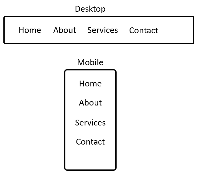
Layout 2 - Responsive Nav Bar Layout
This is a responsive menu navigation bar that shows in rows for desktops and columns for mobiles.
<div fxLayout.gt-sm="row" fxLayout.lt-md="column">
  <div class="grid-item">Home</div>
  <div class="grid-item">About</div>
  <div class="grid-item">Services</div>
  <div class="grid-item">Contact</div>
</div>
.grid-item {
  padding: 10px;
}

.grid-item:hover {
  background-color: lightgray;
  cursor: pointer;
}
Layout 3 - Responsive Side Nav Layout
This is a responsive side nav that adjusts left/right for desktops and top/bottom for mobiles.

<div class="container" fxLayout.gt-sm="row" fxLayout.lt-md="column">
  <div fxFlex.gt-sm="20%" fxFlex.lt-md="20%"
    fxLayoutAlign="center center" class="left">Left</div>
  <div fxFlex.gt-sm="80%" fxFlex.lt-md="80%"
    fxLayoutAlign="center center" class="right">Right</div>
</div>
.container {
  height: 100vh;
}

.left {
  background-color: lightgray;
}

.right {
  background-color: beige;
}
Layout 4 - Responsive Card Layout2
This is another format of responsive card layout.

<div fxLayout="column" fxLayoutGap="10px" class="container">
  <div fxLayout="row" fxFlex="33%" class="block-1">
    <div fxFlex fxLayoutAlign="center center" fxFlexFill class="grid-item">A</div>
  </div>
  <div fxLayout.gt-sm="row" fxLayout.lt-md="column"
      fxLayoutGap="10px" fxFlex="33%" class="block-2">
    <div fxFlex.gt-sm="70%" fxFlex.lt-md="50%" fxLayoutAlign="center center"
      fxFlexFill class="grid-item">B</div>
    <div fxFlex.gt-sm="30%" fxFlex.lt-md="50%" fxLayoutAlign="center center"
      fxFlexFill class="grid-item">C</div>
  </div>
  <div fxLayout="row" fxLayoutGap="10px" fxFlex="33%" class="block-3">
    <div fxFlex.gt-sm="30%" fxFlex.lt-md="50%" fxLayoutAlign="center center"
      fxFlexFill class="grid-item">D</div>
    <div fxFlex.gt-sm="70%" fxFlex.lt-md="50%" fxLayoutAlign="center center"
      fxFlexFill class="grid-item">E</div>
  </div>
</div>
.container {
  padding: 5px;
  height: 100vh;
}

.grid-item {
  background-color: lightsalmon;
  border-radius: 5px;
  padding: 10px;
  height: 100px;
}
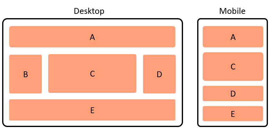
Layout 5 - Holy Grail Layout
This is a responsive holy grail layout.
<div fxLayout="column" fxLayoutGap="10px" class="container">
  <div fxFlex="25%" class="block-1">
    <div fxFlex fxLayoutAlign="center center" fxFlexFill class="grid-item">A</div>
  </div>
  <div fxLayout="row" fxLayout.lt-md="column" fxLayoutGap="10px" fxFlex="50%" class="block-2">
    <div fxFlex fxHide.lt-md fxLayoutAlign="center center"
      fxFlexFill class="grid-item">B</div>
    <div fxFlex="75%" fxLayoutAlign="center center"
      fxFlexFill class="grid-item">C</div>
    <div fxFlex fxLayoutAlign="center center"
      fxFlexFill class="grid-item">D</div>
  </div>
  <div fxFlex="25%" class="block-3">
    <div fxFlex fxLayoutAlign="center center" fxFlexFill class="grid-item">E</div>
  </div>
</div>
.container {
  padding: 5px;
  height: 100vh;
}

.grid-item {
  background-color: lightsalmon;
  border-radius: 5px;
  padding: 10px;
  height: 100px;
}
Hope this helps!